COFFEERIPOOO
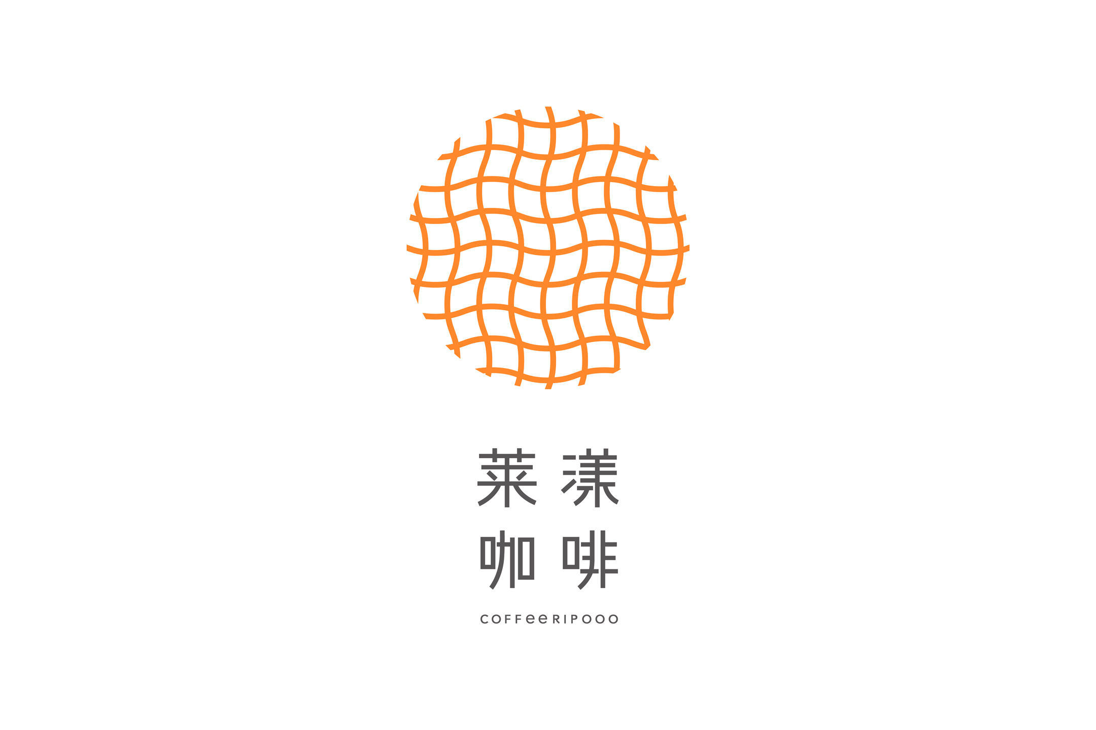
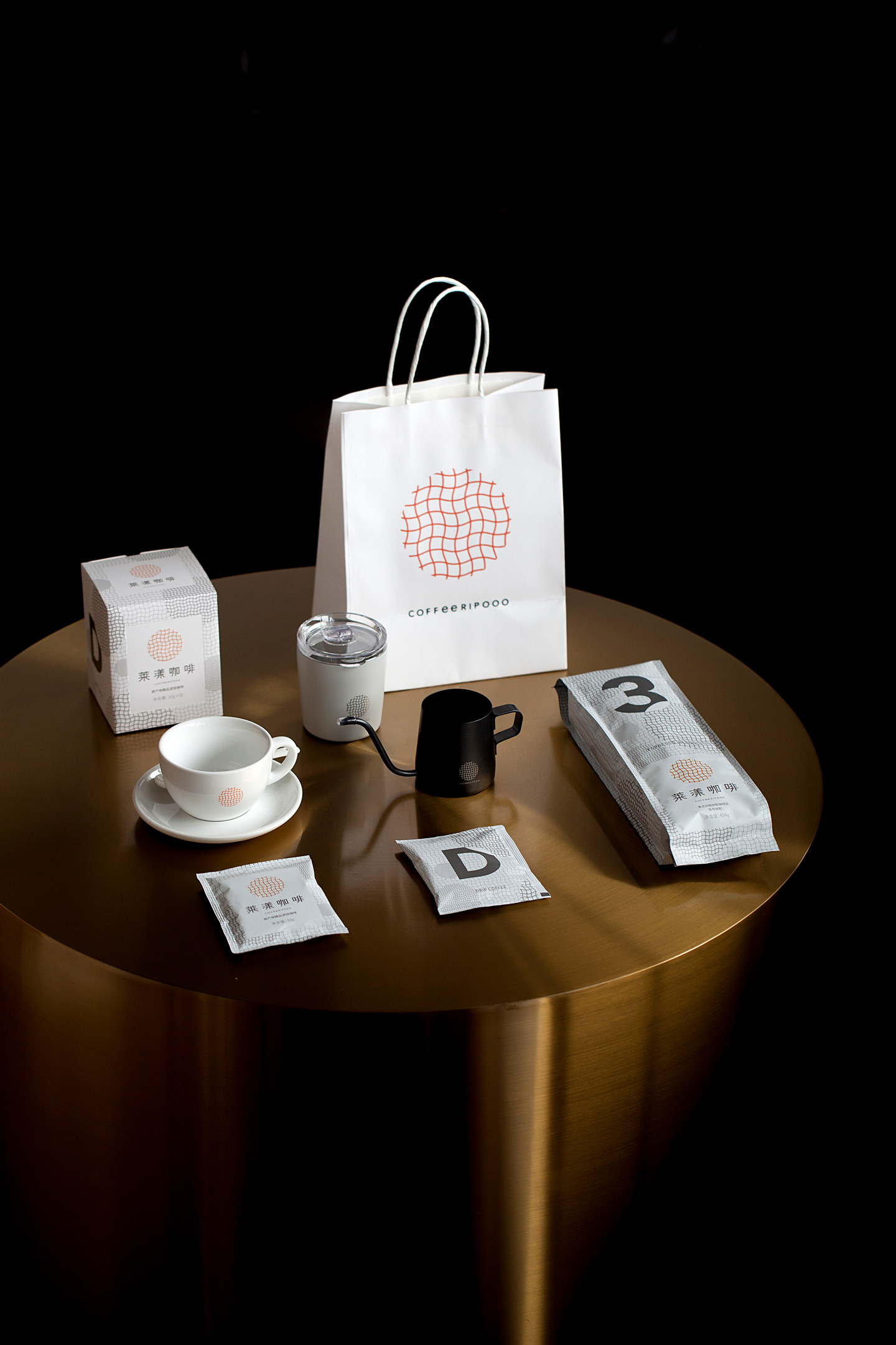
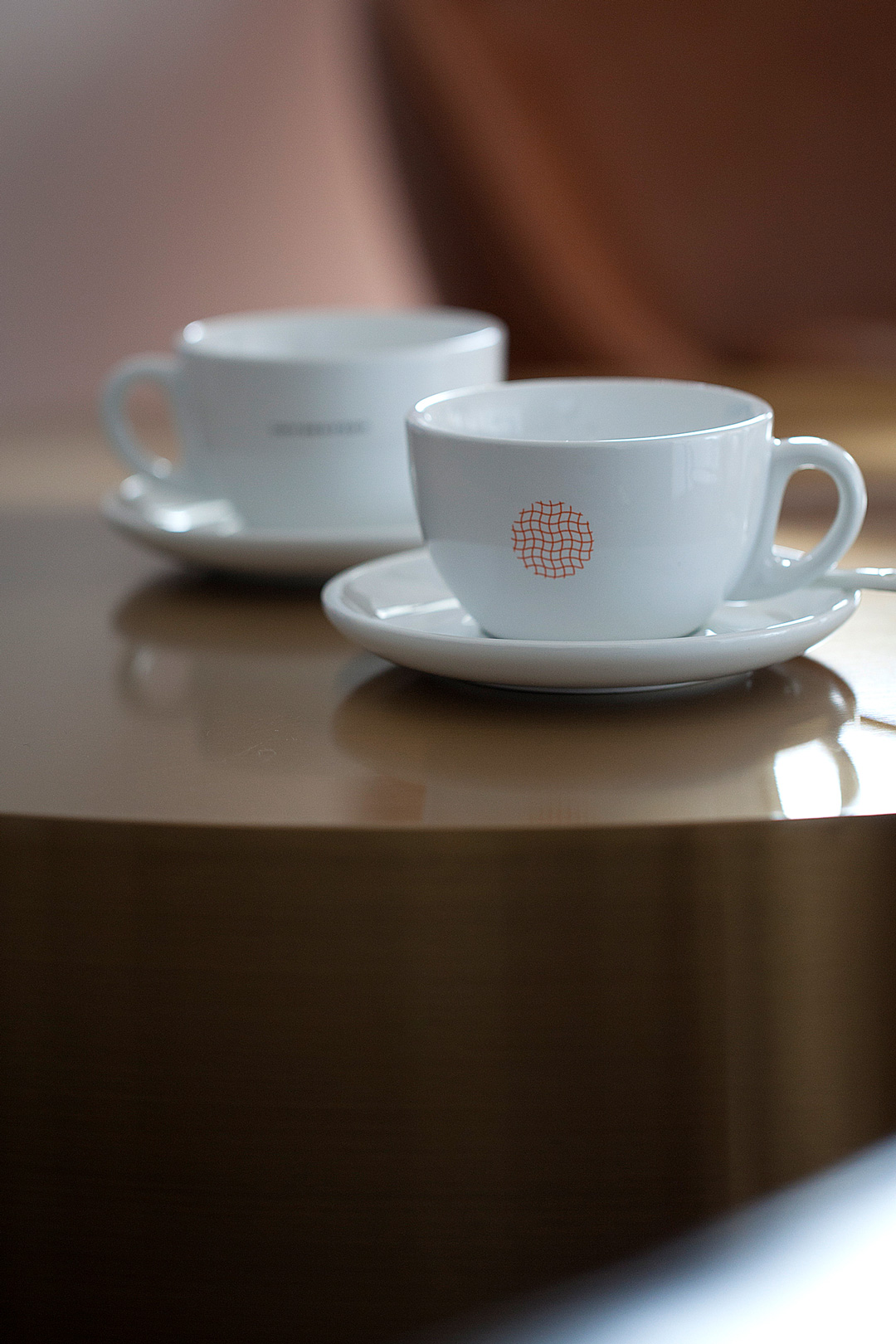
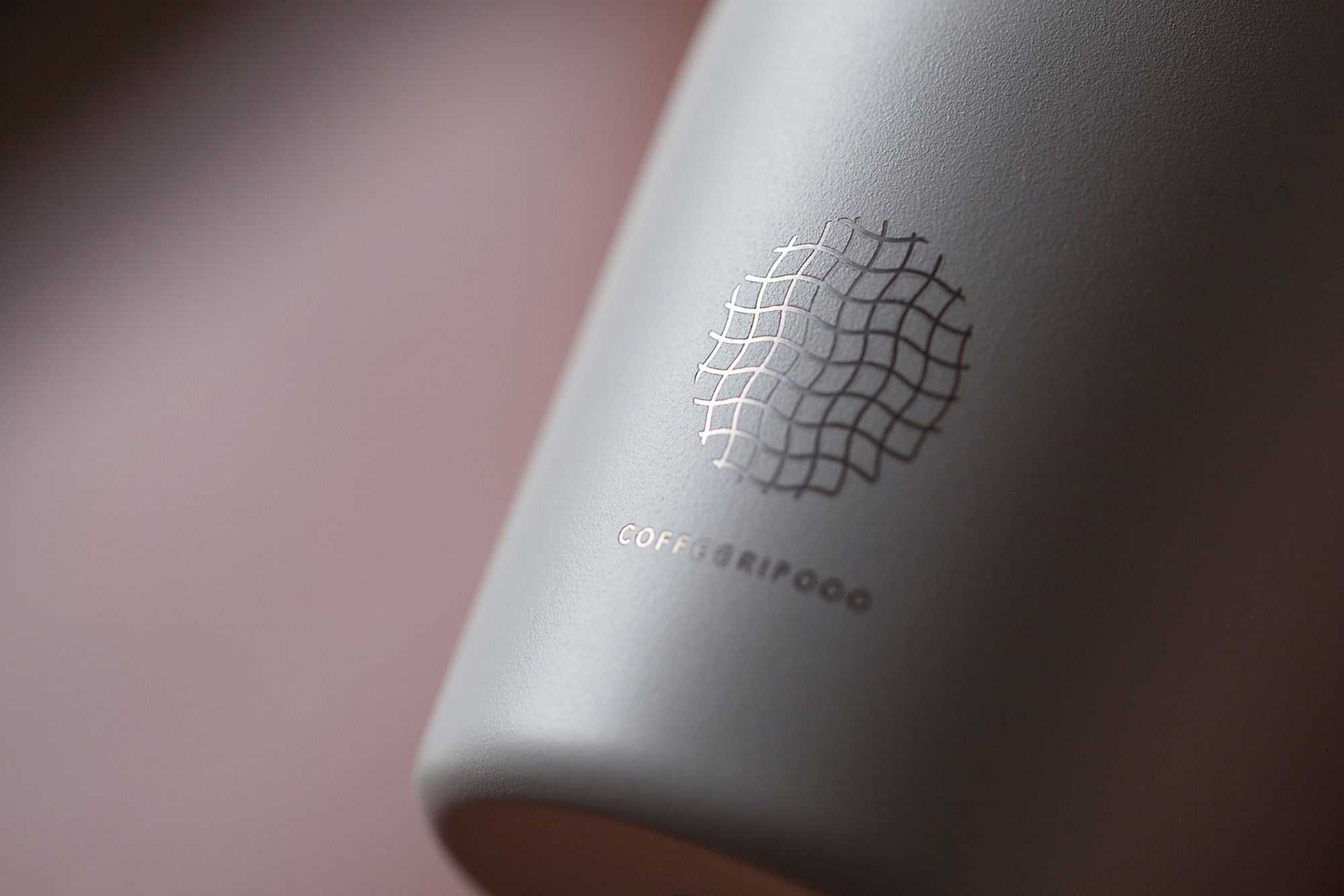
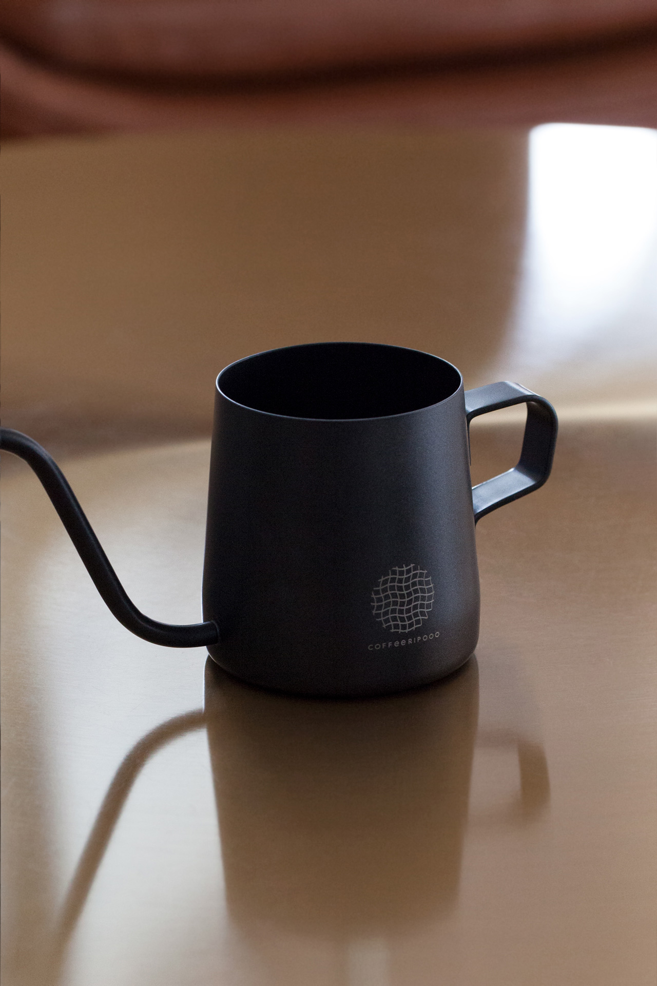
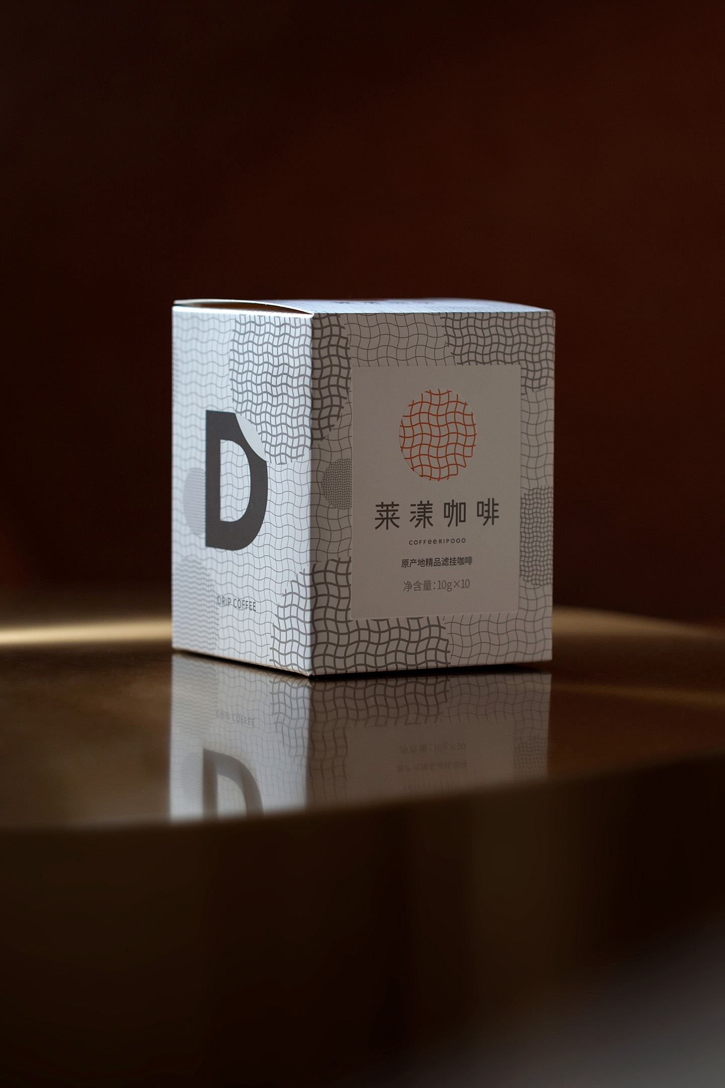
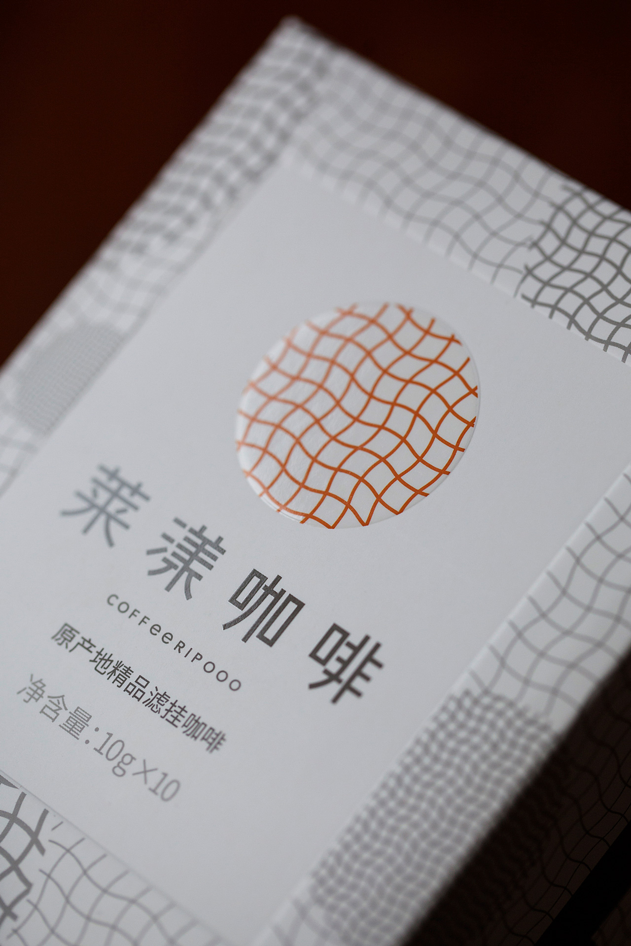
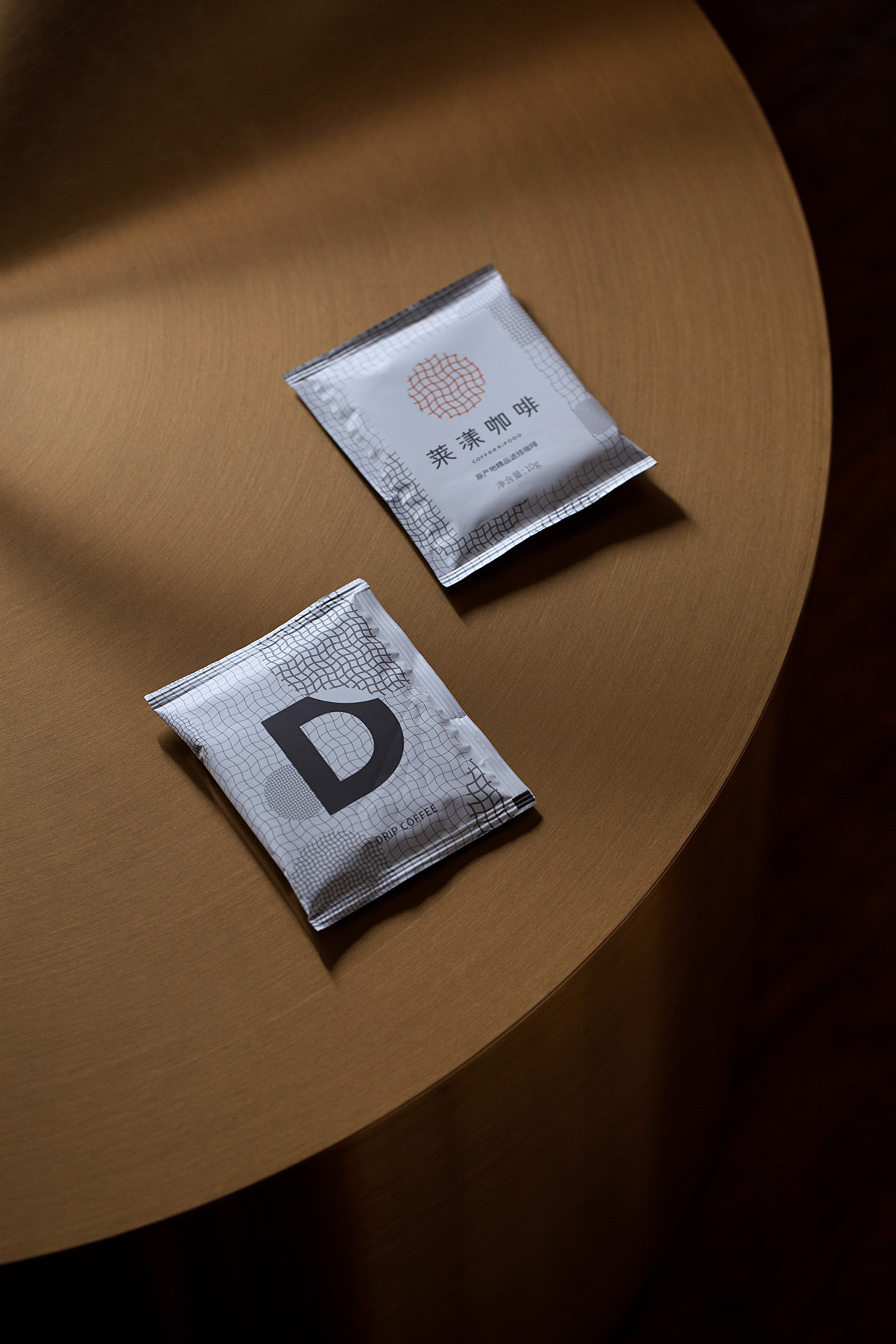
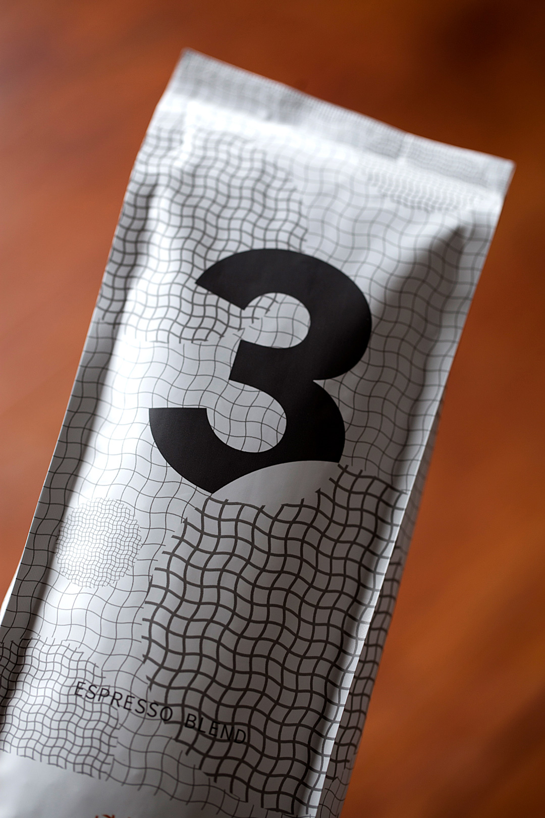
COFFEERIPOOO Research Institute sources great coffee from different countries of origin. It is committed to the research and development of new coffee products, and bringing more great coffee experience to consumers. Based on the idea of “the world in a cup, the ripples of everything”, the brand design brings countries of origin, the name of brand, and consumer experience together logically. A graphic, rather than an animation, consists of the earth in a coup and fluctuating lines of latitude and longitude, which creates a visual illusion effect of ripples in motion. This is how imaginations turn into a spectacular graphic expression indicating directions and possibilities of the systematic brand experience. The standard color of the brand is inspired by the light reflected on the coffee. The light irradiates over the coffee is bright and graceful in a restrained way, which makes it imperceptible and thus let consumers feel comfortable and pleasant. The logo becomes an emotional code that gives people warmth and resonance.
莱漾咖啡研究所将取自全球原产地的好咖啡带给消费者品享,并致力于新型咖啡产品的研发,希望将咖啡的更多美好体验带给人们。品牌设计以“杯中的世界,荡漾的万象”为创意,使全球原产地、品牌名称和受众体验形成通顺的逻辑。标志将代表世界的地球图形放入杯中,让经纬线波动起来,形成了一个不是动画特效,却令眼球感到荡漾感的视错觉图形,洋洋大观由此而生,诸般想象融为了形象,系统化的品牌体验据此生成了方向与可能。品牌的标准色汲取于反射在咖啡上的灯光,那些与咖啡交融的灯光轻轻晃动,鲜明而内敛,灵动而克制,不易被注意却定是有人觉察且因此愉悦,这也成为含于其中、予人温暖、映照心灵的情感密码和期望。