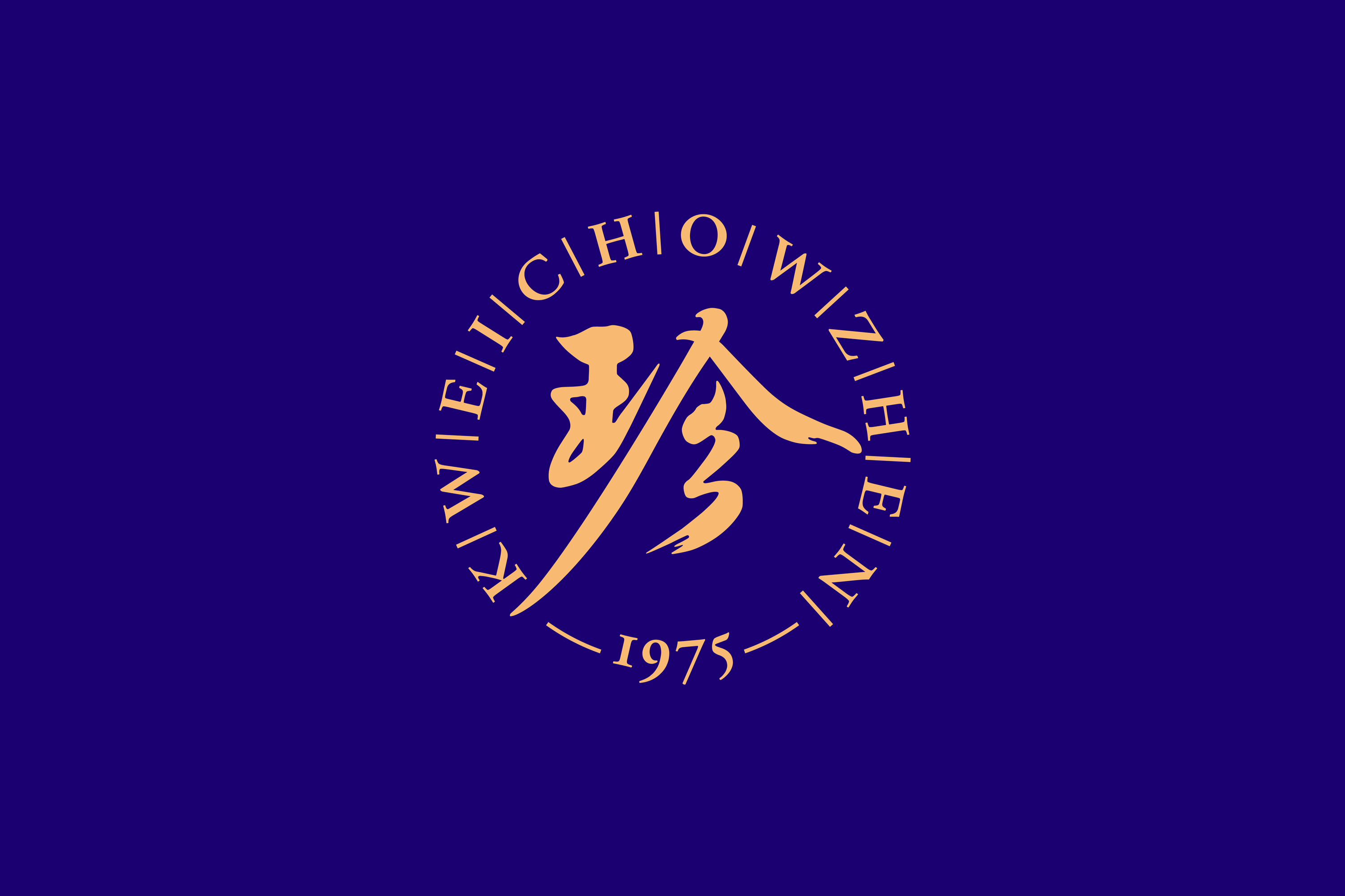
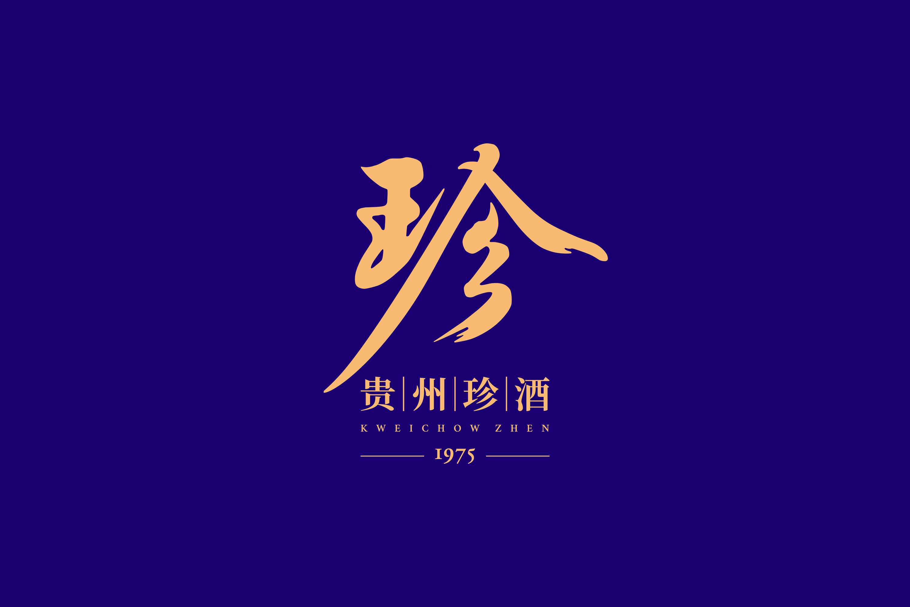
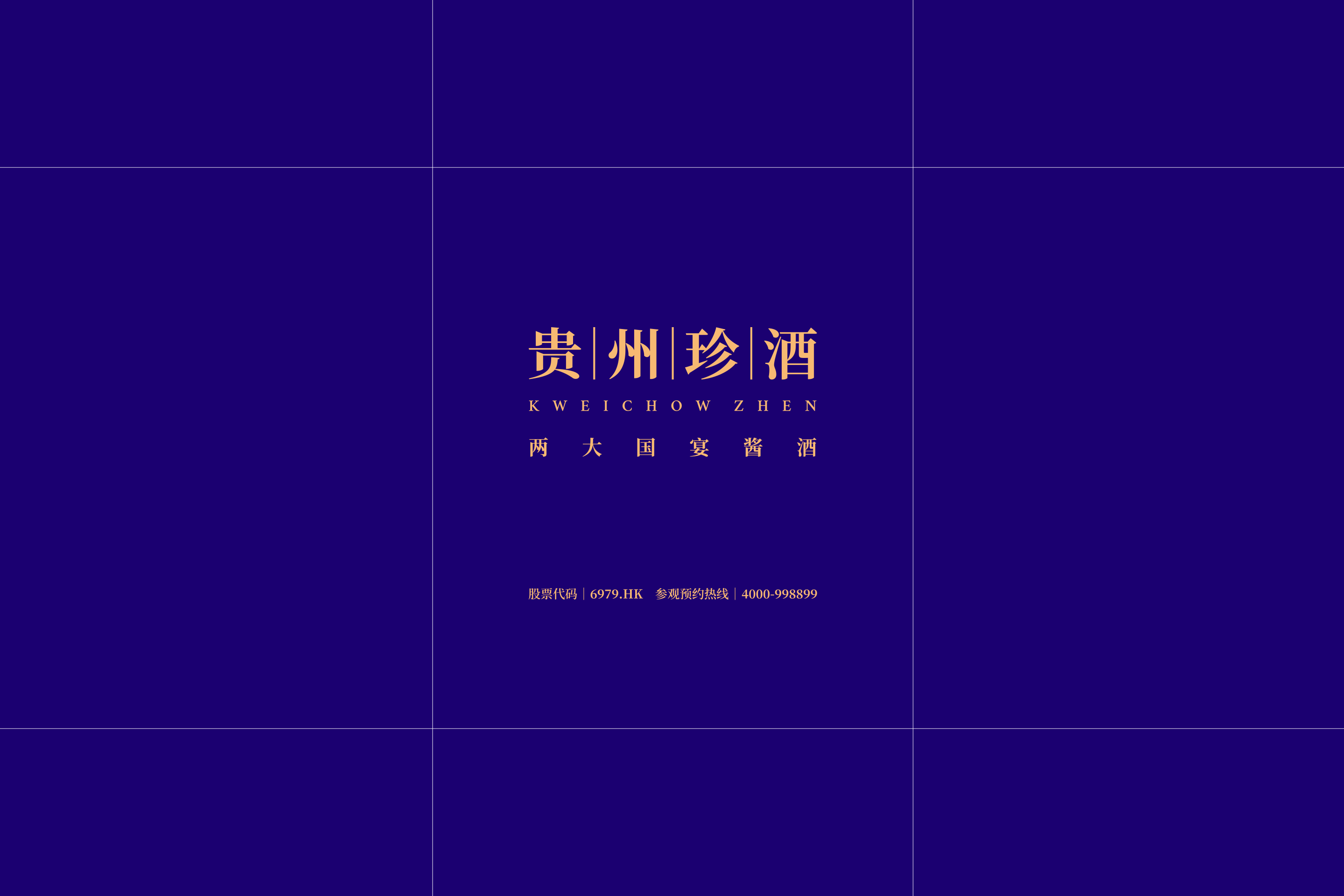
KWEICHOW ZHEN
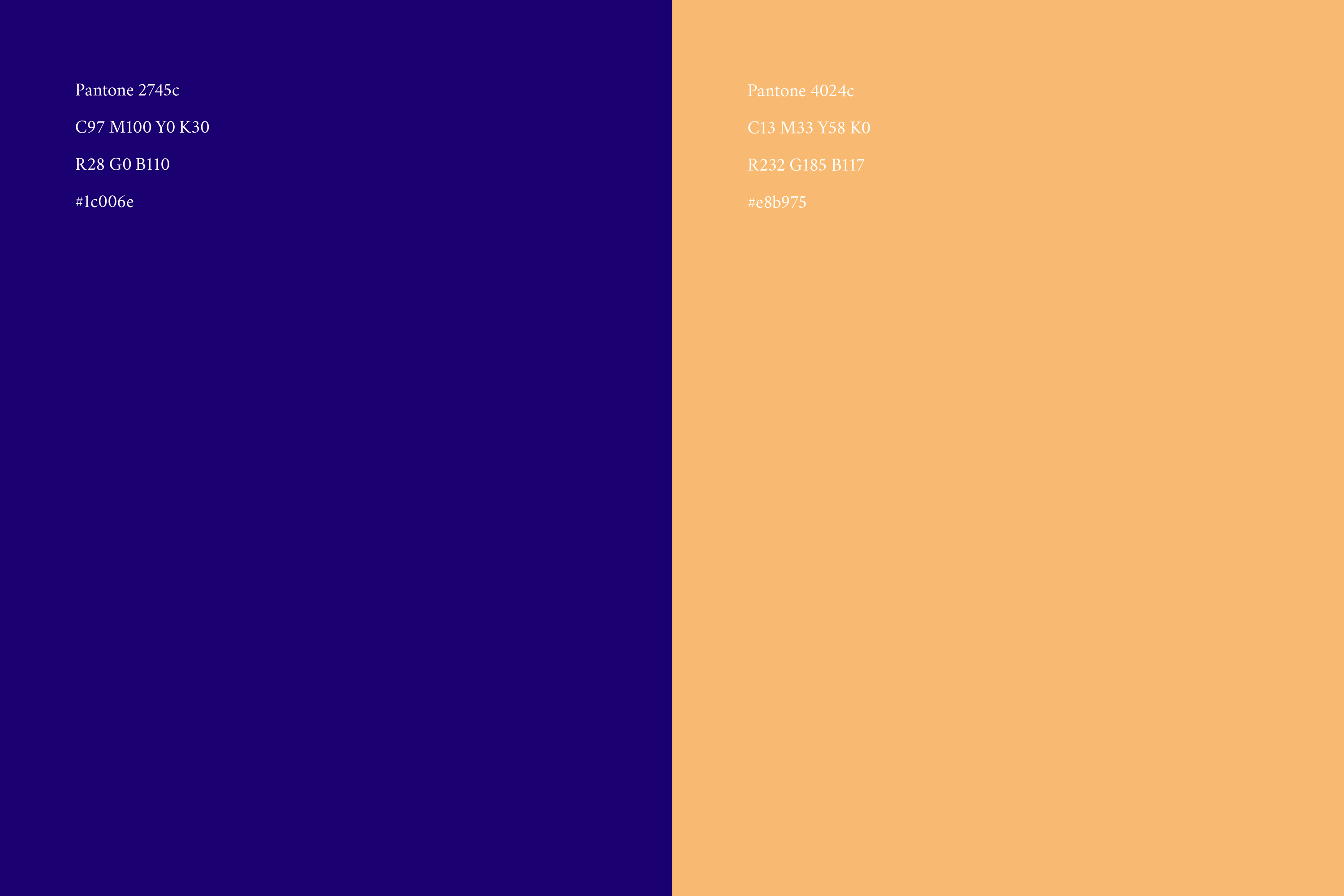
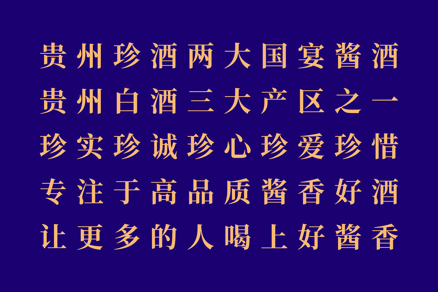
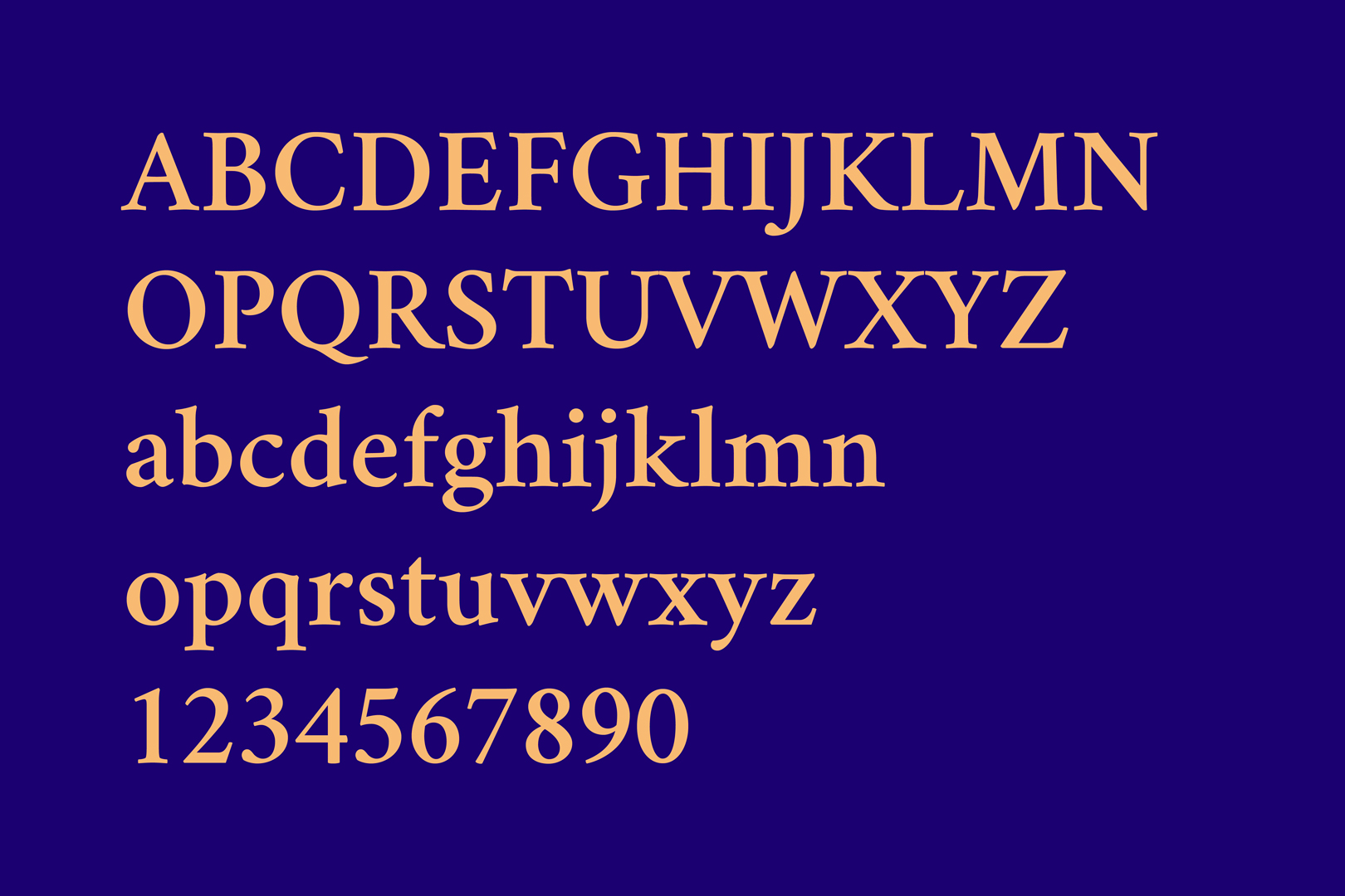
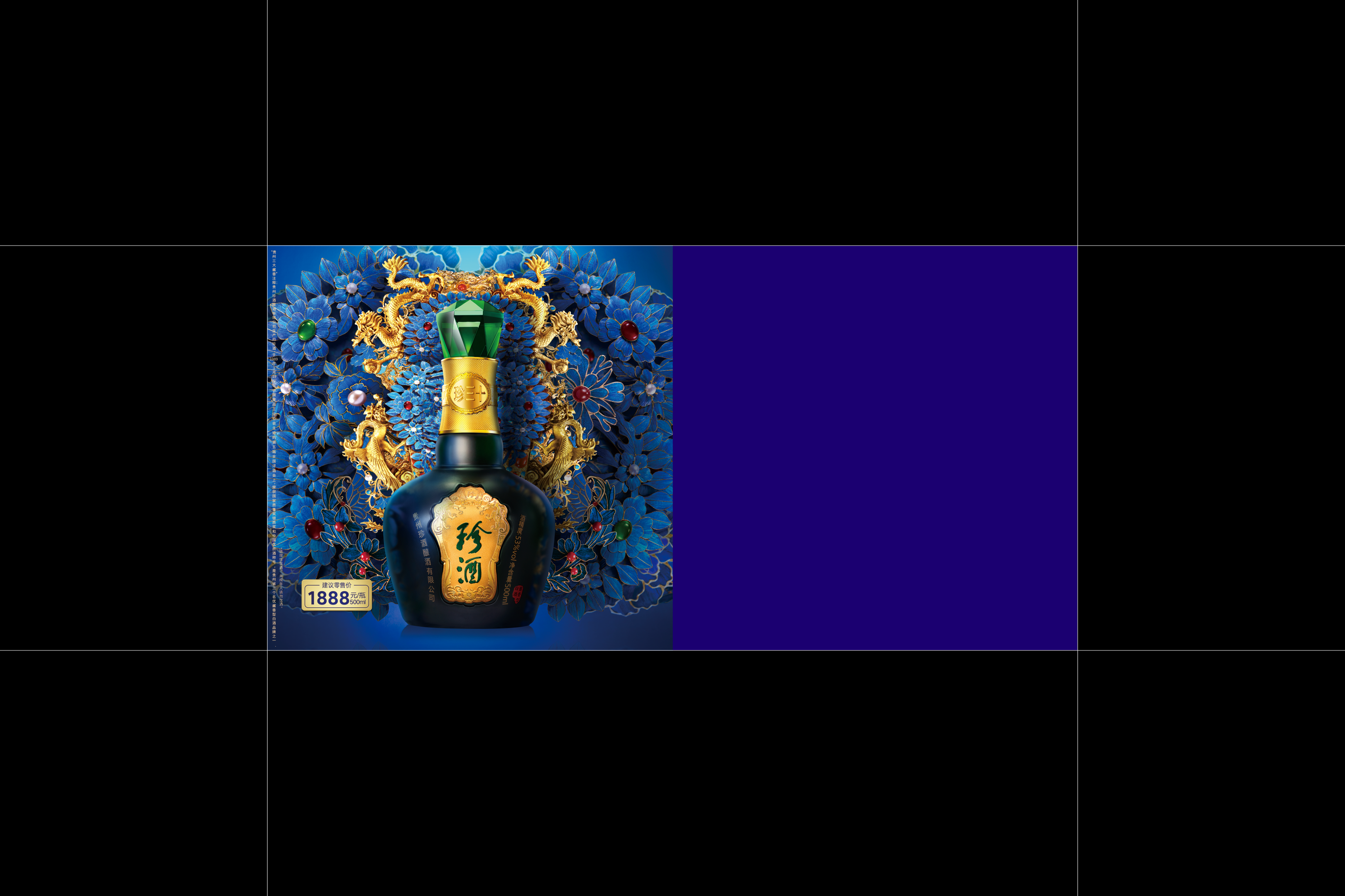
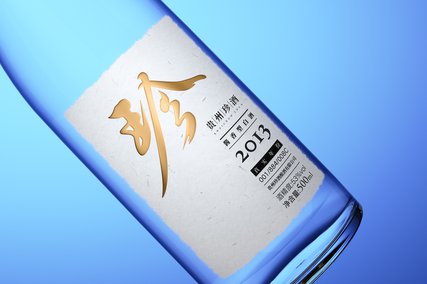
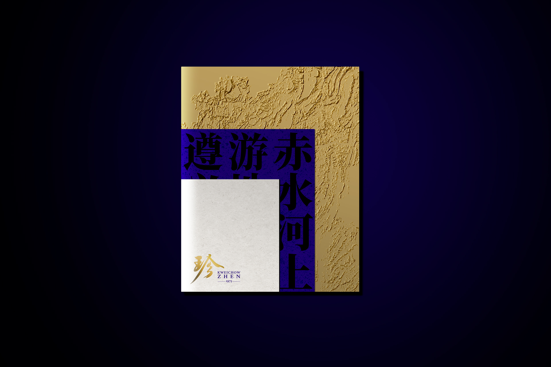
The visual identity system upgrade for KWEICHOW ZHEN involves hierarchically structuring brand visual elements into modular systems, ensuring orderly visual communication and preventing application inconsistencies. The "珍" (Zhen) character symbol traces back to the cultural essence of the Sanxitang Fa Tie(《三希堂法帖》), with revitalized typography that interprets sixfold tasting experiences through stroke variations, solidifying the character as a proprietary emblem. A serif typeface enhances communicative versatility, while refined brand colors embody the "essence of Zhen" philosophy. A 4:6 aesthetic ratio standardizes proportions, establishing a signature visual proportion style.
贵州珍酒品牌视觉形象(VI)系统升级将品牌视觉元素进行层级划分,构建为视觉系统模块,避免应用混乱,确保有序化视觉传播; 珍字符号溯源《三希堂法帖》文化精髓,更新字体设计,并以笔画诠释六重品酒体验,促进“珍”字成为专有符号;启用衬线型字体增强传播宜用性,调整标准色诠释“珍之源”意境,并设定4:6品牌美学比例规范,形成品牌视觉比例风格。