AOKANG LEATHERWARE
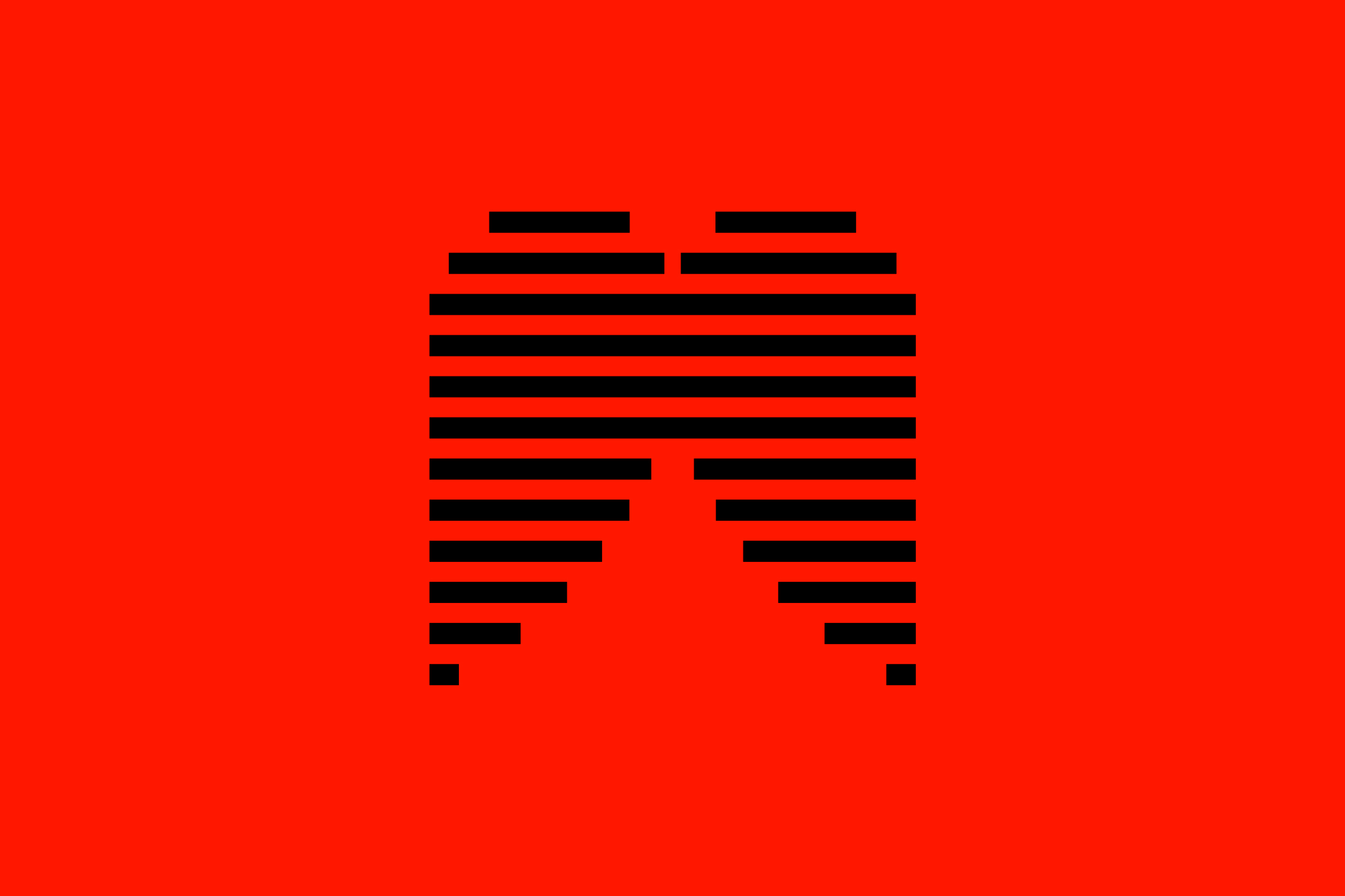
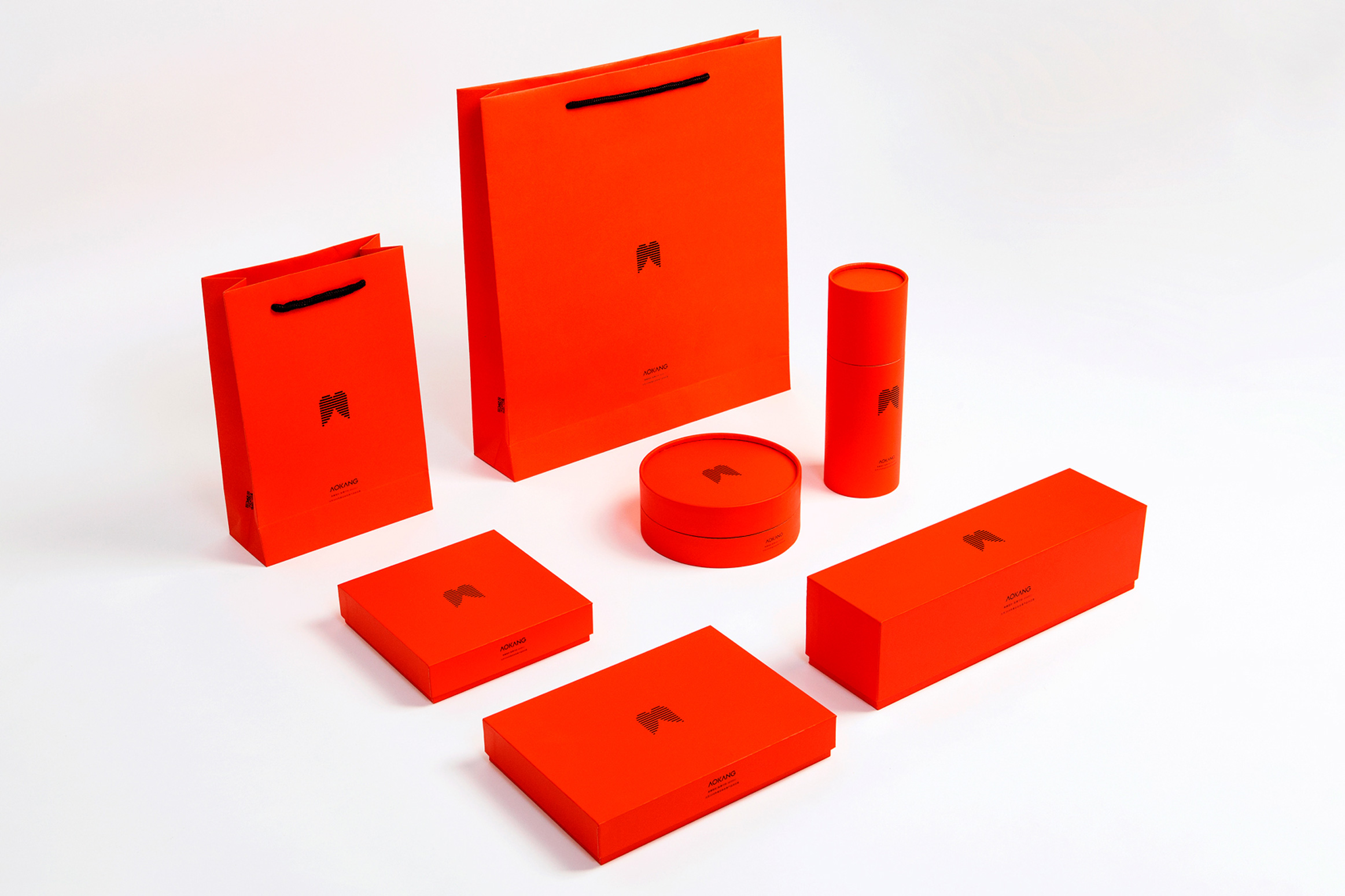
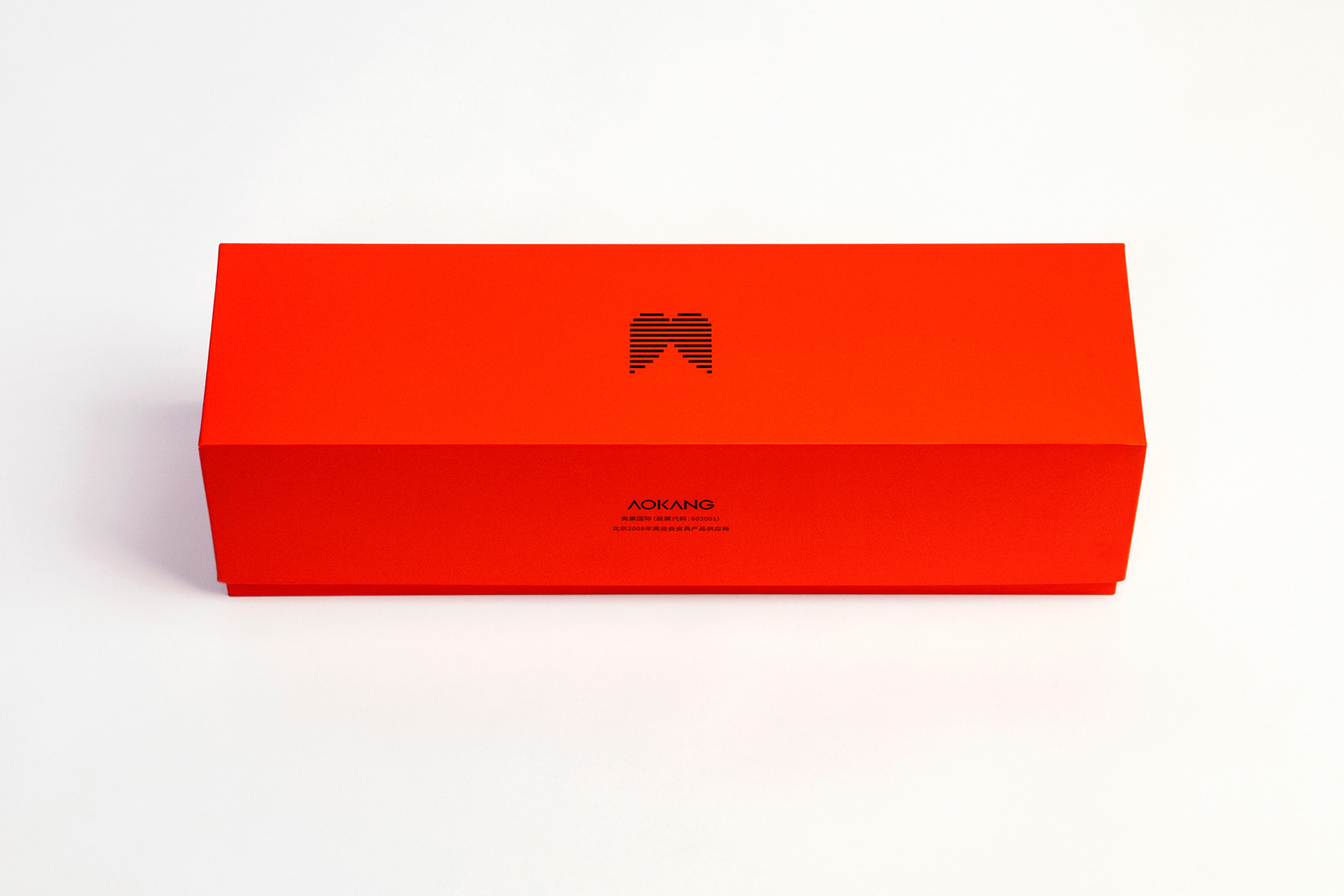
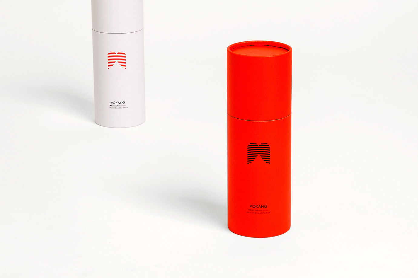
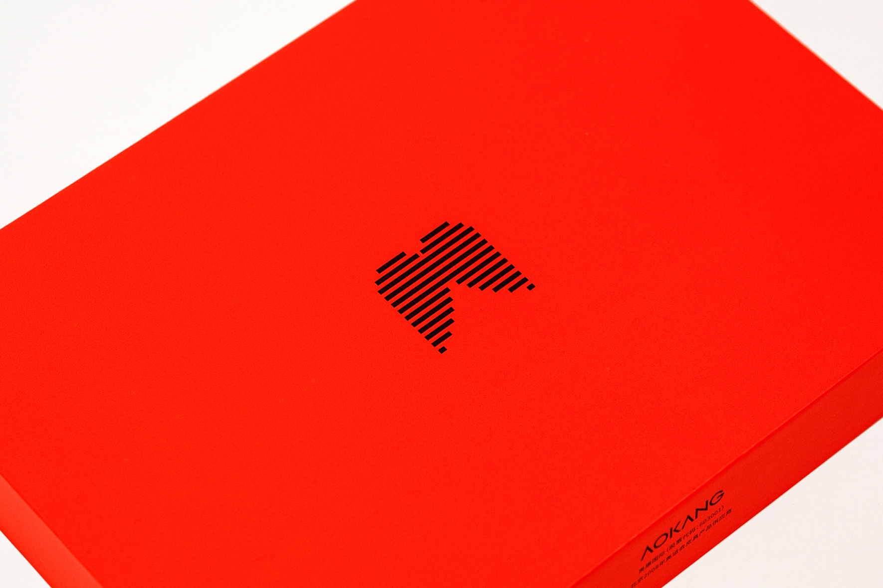
Aokang Leatherware Brand Image Redesign: Under the premise of maintaining brand consistency and retaining the original logo shape, D.D.C reimagined Aokang’s "wing" emblem through linear segmentation. This approach lightens the graphic’s visual weight, creates kinetic energy, and integrates the symbol with warm red sky tones. A unified packaging system resolves previous clutter while cost-efficiently using adaptable labels and universal packaging boxes for diverse products.
奥康皮具品牌的形象重塑设计。D.D.C龙堂在保持品牌体系化、不改变原标志形态的前提下,将奥康“翅膀”新标志进行了线状切割变体设计,轻化图形体量感,创生飞行动感,促进符号与暖红色天空的融合,并营造整齐划一的形象解决包装系统杂乱问题,通过仅需变换产品标签、可容纳不同产品的通版包装盒实现包装成本的节约控制。